Client:
Shaftesbury Films
Project:
Series/Features Brochure
Overview:
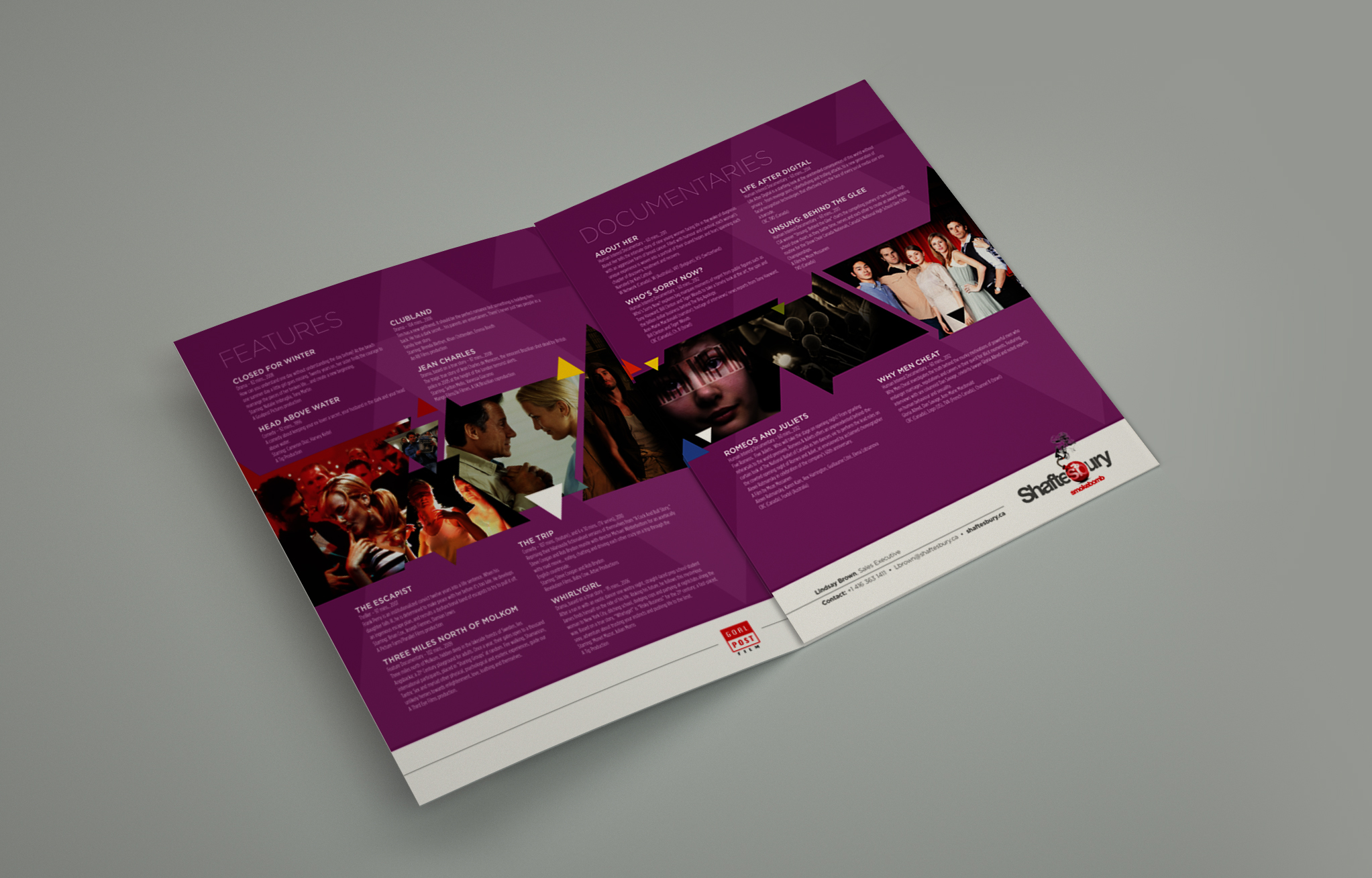
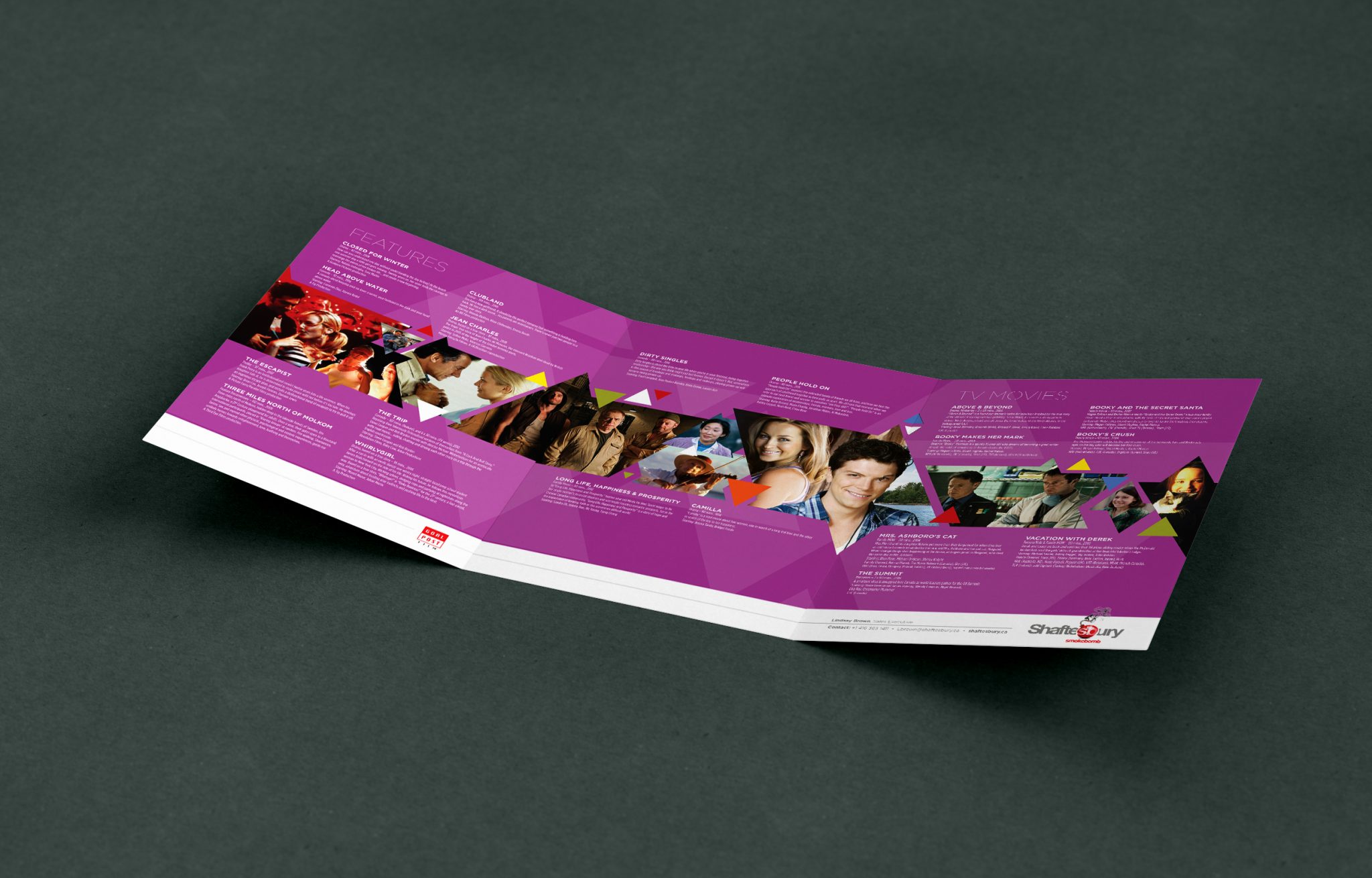
This was one of those projects that started out a few years earlier, and was iterated on a few times a year until one day, we had a conversation about doing something different. The project lead specifically asked for the use of pink, which was a sticking point with the other stakeholders, who were far less enthusiastic about it. "Nobody uses pink! It's going to look ridiculous! People are won't want to touch it!" Needless to say, there wasn't a lot of enthusiasm for the colour.
After begrudging agreements to let us "give it a go," we sort of headed into uncharted waters as I started to build. I had never used pink to this extent on a project like this, but instead of trying to "tone it down," or "tame it" with other colours or effects, and after more conversations with the stakeholders (who still weren't on the same page about it), I just decided to own it.
The end result really blew everyone away, which was a huge as the project lead decided to keep it from them all until it was ready to go so that they could see the complete package and not iterate the fun out of it. It went over super well at the trade shows and festivals, and they've been using it ever since. You can't ask for much more than that.
Well, maybe you could, but that'd probably just be rude.


Let's work together.
Get in touch.
Email:
info@theninefive.com
Phone:
+1 416 992 9985
Instagram:
@TheNineFiveDesign
© 2002–2025 The NineFive Design, Inc. All rights reserved.