Client:
Smucker's Canada
Project:
Product Packaging
Overview:
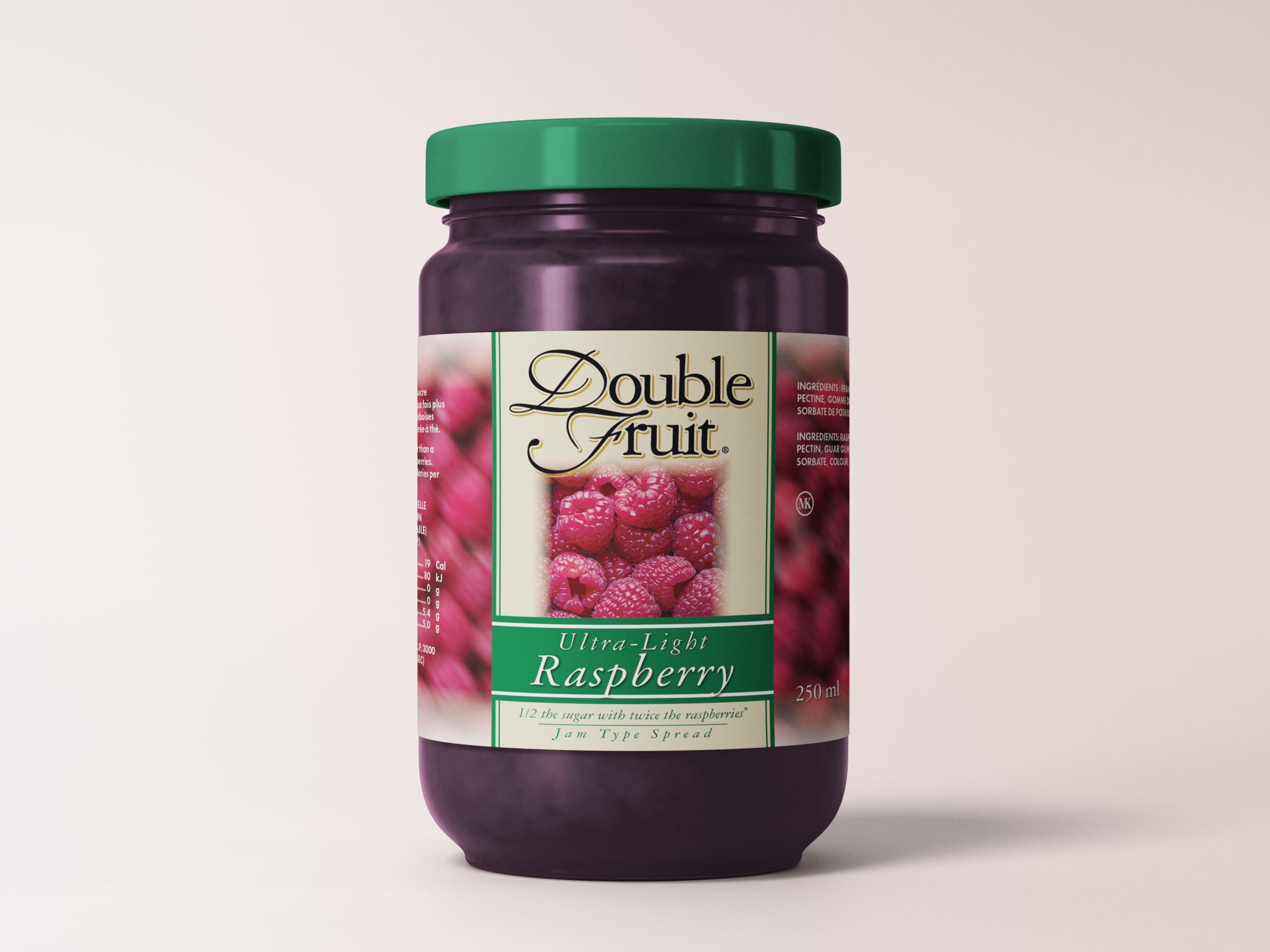
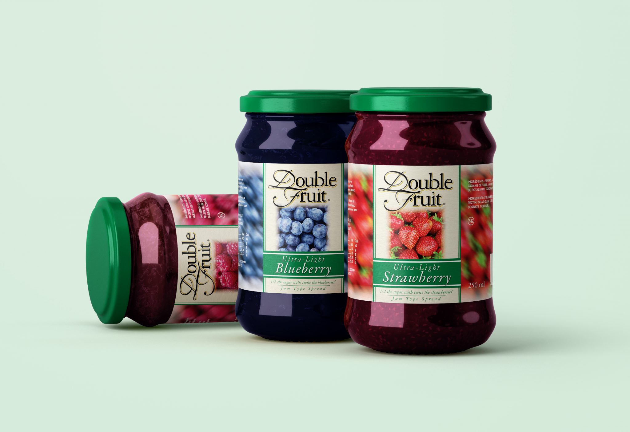
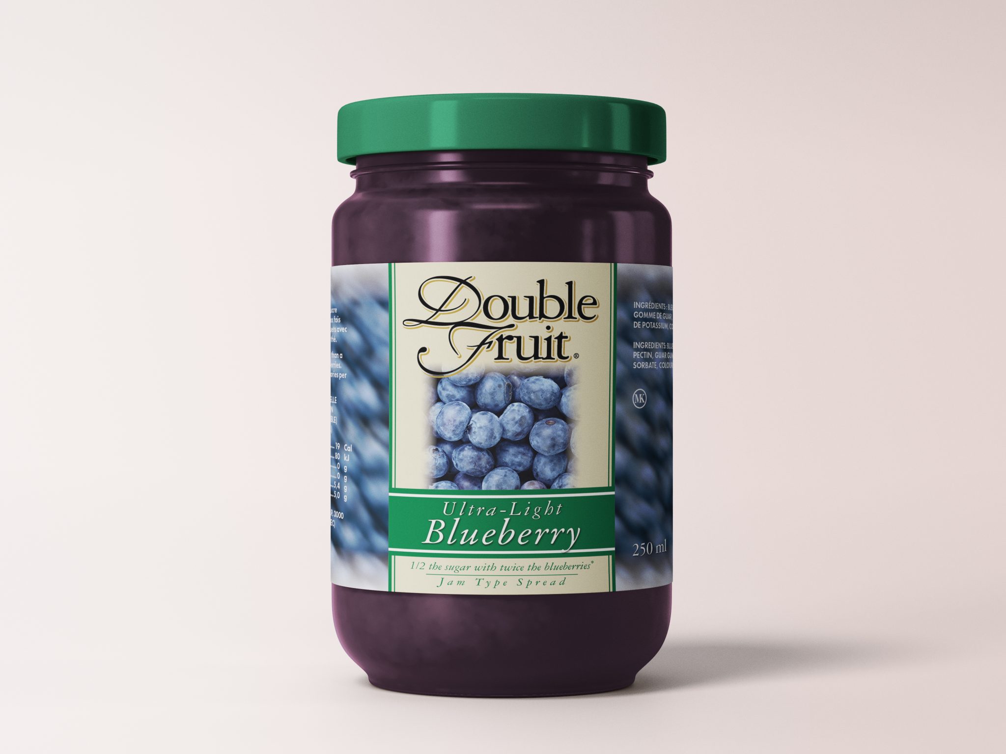
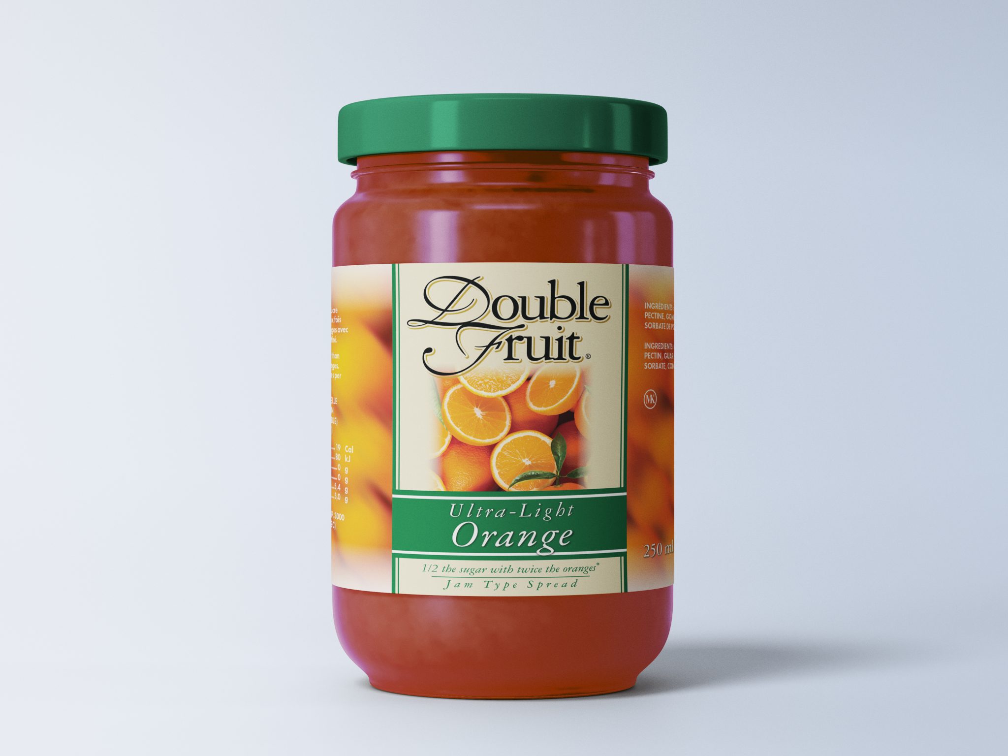
Years ago, back when I could run faster, jump higher, and have a perfectly productive day on three hours' sleep, I was presented with an opportunity to work on product packaging for Smucker's. I remember being SO excited about this one. It was the first time I had a shot on something big and I hadn't done much product packaging at all to that point. To be honest, I'm still not sure what my boss what thinking when they let me take it on. The weight of what I didn't know far outweighed the weight of what I did, so the learning curve was quite steep, and the stakes were high.
If you've ever done consumer packaged good, especially food, you'll know that there are a huge amount of government regulations involved that govern everything from what a product can be called/considered as, to the order of the ingredients, to font sizes, etc. Add to that the fact that these were being developed for the Canadian market, so they also had to be bilingual (English and French). I had to build four versions of each flavour, four sizes of each of those flavours, and then three separate "sugar-content" (Regular, Light, Ultra-Light) versions of each of those. Needless to say, there was a lot to bear in mind, and a lot to keep track of for a guy with little experience. Mistakes were made for sure, but I learned A LOT from this particular job. I still look back on it fondly and I'll never forget how excited I was when I found out I was going to get to do it.


Let's work together.
Get in touch.
Email:
info@theninefive.com
Phone:
+1 416 992 9985
Instagram:
@TheNineFiveDesign
© 2002–2025 The NineFive Design, Inc. All rights reserved.